FOREST FIRES IN BRAZIL
See https://www.kaggle.com/gustavomodelli/forest-fires-in-brazil for a full description of the dataset.
Import packages
import pandas as pd #Handle datasets
import seaborn as sns #Plots
import matplotlib.pyplot as plt  #Plots
import matplotlib

#Set some graphical parameters
rc={'axes.labelsize': 25, 'figure.figsize': (20,10),
    'axes.titlesize': 25, 'xtick.labelsize': 18, 'ytick.labelsize': 18}
sns.set(rc=rc)

#Path data
path = 'C:/Users/Andreella/Desktop/Doc/GitHub/angeella.github.io/Data'
df = pd.read_csv(path + '/amazon.csv',encoding="ISO-8859-1")
First \(3\) observations:
| year | state | month | number | date | |
|---|---|---|---|---|---|
| 0 | 1998 | Acre | Janeiro | 0.0 | 1998-01-01 |
| 1 | 1999 | Acre | Janeiro | 0.0 | 1999-01-01 |
| 2 | 2000 | Acre | Janeiro | 0.0 | 2000-01-01 |
Some information about the variables:
## <class 'pandas.DataFrame'>
## RangeIndex: 6454 entries, 0 to 6453
## Data columns (total 5 columns):
##  #   Column  Non-Null Count  Dtype
## ---  ------  --------------  -----
##  0   year    6454 non-null   int64
##  1   state   6454 non-null   str
##  2   month   6454 non-null   str
##  3   number  6454 non-null   float64
##  4   date    6454 non-null   str
## dtypes: float64(1), int64(1), str(3)
## memory usage: 252.2 KB
We are interested about the number of forest fires in Brazil
## count    6454.000000
## mean      108.293163
## std       190.812242
## min         0.000000
## 25%         3.000000
## 50%        24.000000
## 75%       113.000000
## max       998.000000
## Name: number, dtype: float64
To have an simple plot, we take a subset of the dataset:
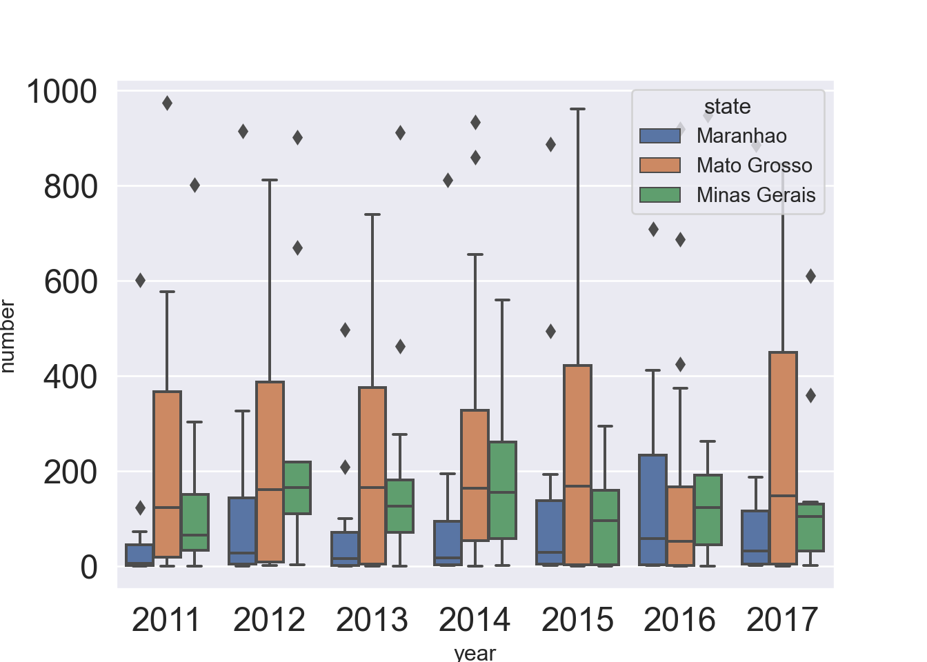
We do a boxplot about the number of fire by groups, i.e., the states and the years.
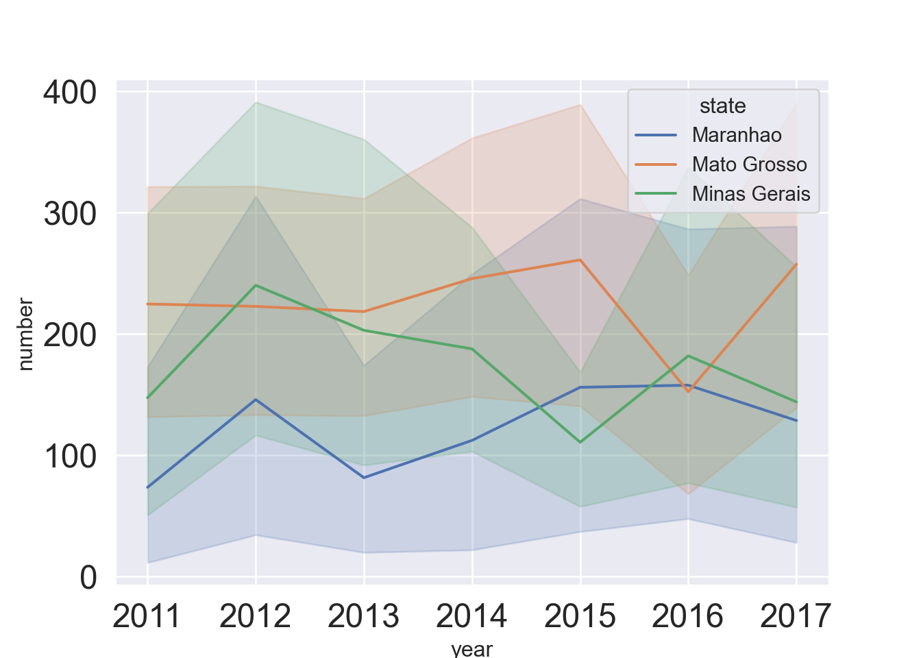
We do a timeseries plot with error bands:
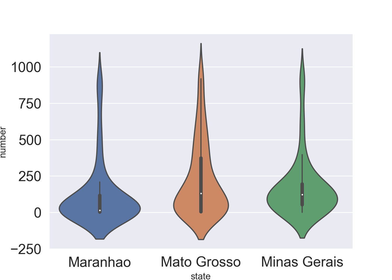
also we do a grouped violinplots:
For other plots, please refers to https://seaborn.pydata.org/examples/index.html.
ECONOMIC FREEDOM INDEX
See https://www.kaggle.com/lewisduncan93/the-economic-freedom-index for a full description of the dataset.
Load and preprocess data
dt = pd.read_csv(path + '/economic_freedom_index2019_data.csv',encoding="ISO-8859-1")
dt.columns = dt.columns.str.replace(' ', '')
dt.columns = dt.columns.str.replace('2019', '')
dt.columns = dt.columns.str.replace('%', '')
dt.columns = dt.columns.str.replace('(', '')
dt.columns = dt.columns.str.replace(')', '')
dt = dt.dropna(axis = 0,how='any')
Basic info
## <class 'pandas.DataFrame'>
## Index: 173 entries, 0 to 185
## Data columns (total 34 columns):
##  #   Column                 Non-Null Count  Dtype
## ---  ------                 --------------  -----
##  0   CountryID              173 non-null    int64
##  1   CountryName            173 non-null    str
##  2   WEBNAME                173 non-null    str
##  3   Region                 173 non-null    str
##  4   WorldRank              173 non-null    float64
##  5   RegionRank             173 non-null    float64
##  6   Score                  173 non-null    float64
##  7   PropertyRights         173 non-null    float64
##  8   JudicalEffectiveness   173 non-null    float64
##  9   GovernmentIntegrity    173 non-null    float64
##  10  TaxBurden              173 non-null    float64
##  11  Gov'tSpending          173 non-null    float64
##  12  FiscalHealth           173 non-null    float64
##  13  BusinessFreedom        173 non-null    float64
##  14  LaborFreedom           173 non-null    float64
##  15  MonetaryFreedom        173 non-null    float64
##  16  TradeFreedom           173 non-null    float64
##  17  InvestmentFreedom      173 non-null    float64
##  18  FinancialFreedom       173 non-null    float64
##  19  TariffRate             173 non-null    float64
##  20  IncomeTaxRate          173 non-null    float64
##  21  CorporateTaxRate       173 non-null    float64
##  22  TaxBurdenofGDP         173 non-null    float64
##  23  Gov'tExpenditureofGDP  173 non-null    float64
##  24  Country                173 non-null    str
##  25  PopulationMillions     173 non-null    str
##  26  GDPBillions,PPP        173 non-null    str
##  27  GDPGrowthRate          173 non-null    float64
##  28  5YearGDPGrowthRate     173 non-null    float64
##  29  GDPperCapitaPPP        173 non-null    str
##  30  Unemployment           173 non-null    str
##  31  Inflation              173 non-null    float64
##  32  FDIInflowMillions      173 non-null    str
##  33  PublicDebtofGDP        173 non-null    float64
## dtypes: float64(24), int64(1), str(9)
## memory usage: 47.3 KB
Some plots
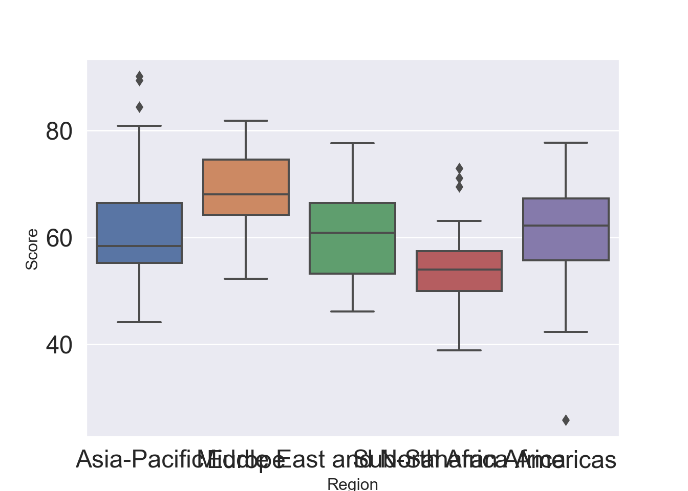
Boxplot by group, i.e. region:
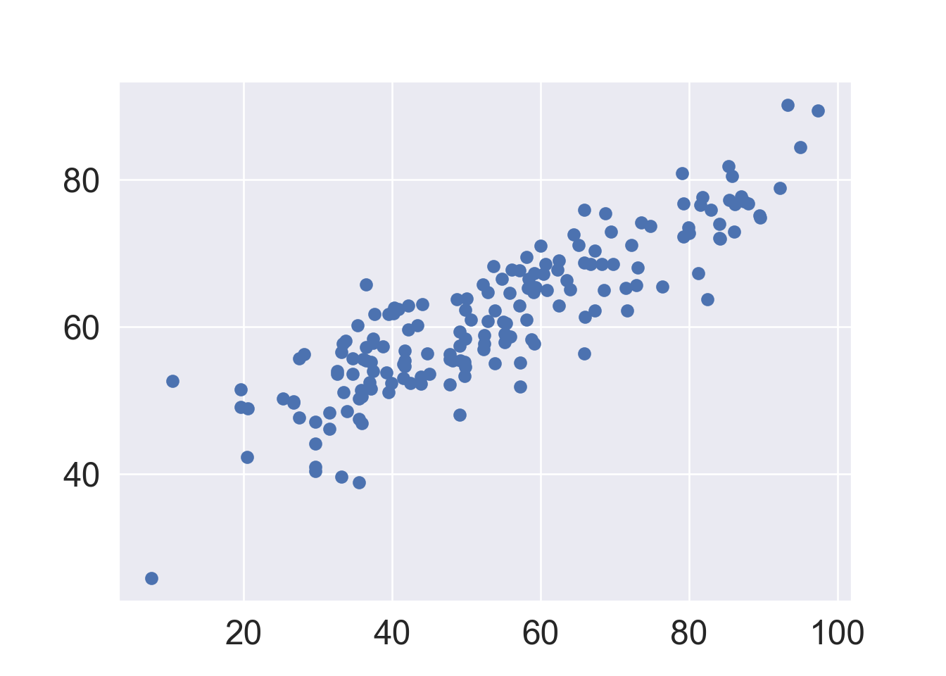
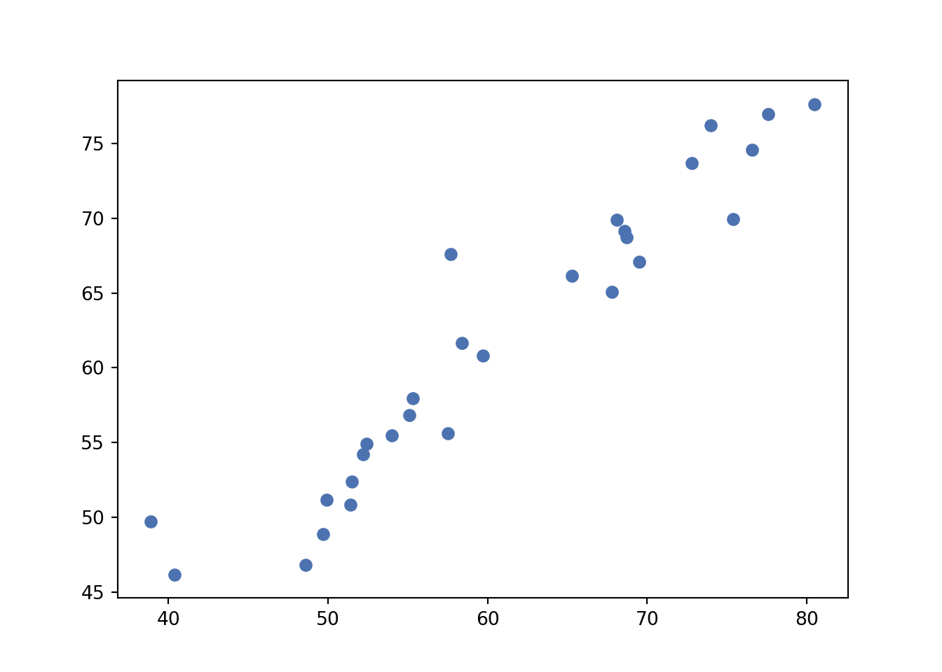
First scatter plot:
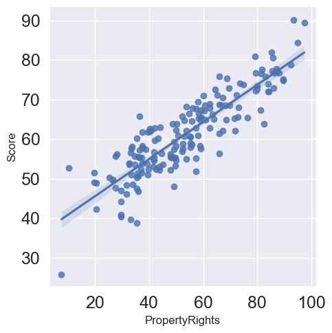
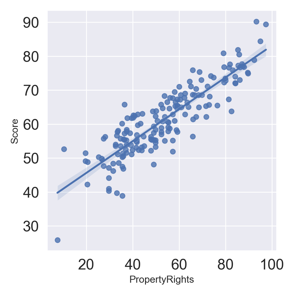
We can put directly the linear regression fitting:
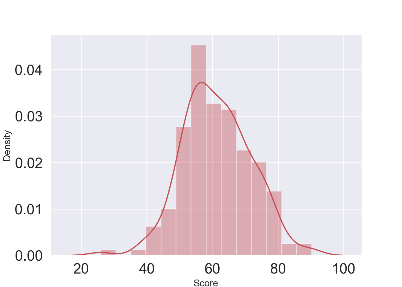
Density plot of the score variable:
Pair plot considering some variables, i.e. Property Rights, Labor Freedom, Government Integrity, Judical Effectiveness, Fiscal Health, Region and Score:
dt1 = dt[['PropertyRights', 'LaborFreedom', 'GovernmentIntegrity', 'JudicalEffectiveness','FiscalHealth', "Score", 'Region']]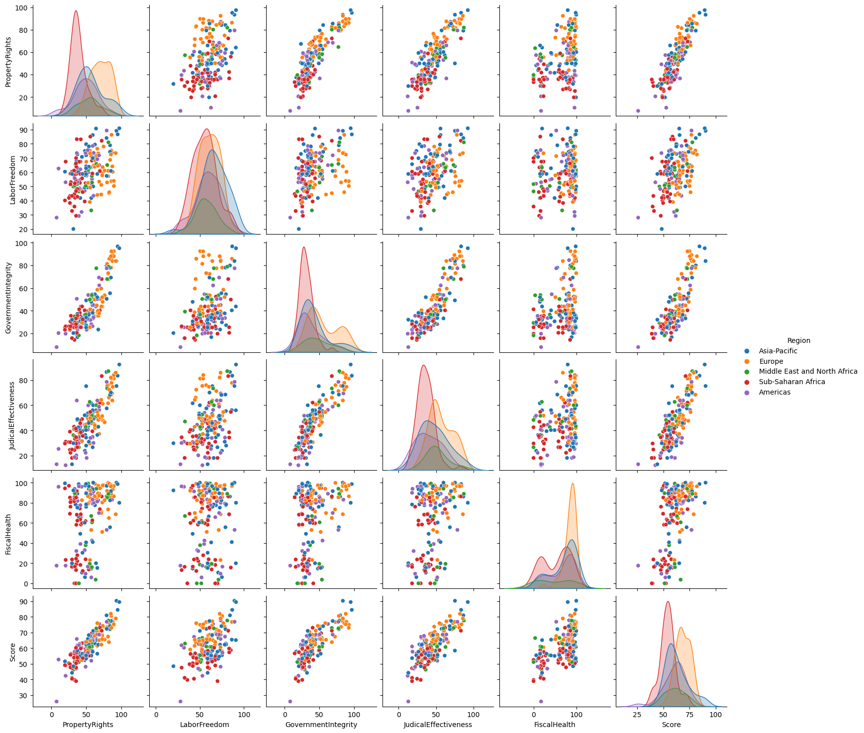
Linear regression
Import packages
import statsmodels.api as sm
import statsmodels.formula.api as smf
from sklearn.metrics import mean_squared_error
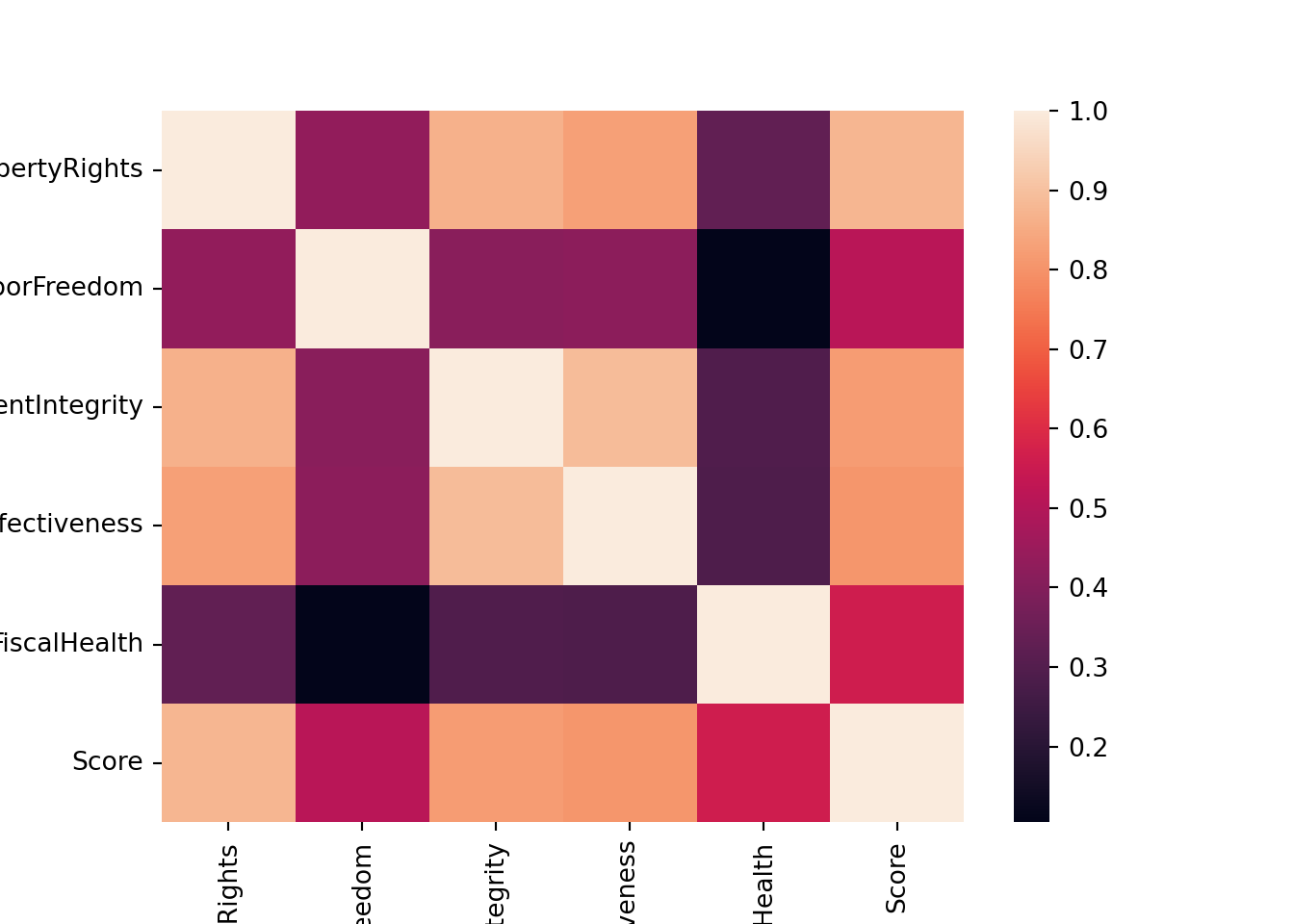
import sklearnCorrelation matrix
corr = dt[['PropertyRights', 'LaborFreedom', 'GovernmentIntegrity', 'JudicalEffectiveness','FiscalHealth', "Score"]].corr()
corr| PropertyRights | LaborFreedom | GovernmentIntegrity | JudicalEffectiveness | FiscalHealth | Score | |
|---|---|---|---|---|---|---|
| PropertyRights | 1.000000 | 0.432746 | 0.866998 | 0.826805 | 0.329969 | 0.876601 |
| LaborFreedom | 0.432746 | 1.000000 | 0.413794 | 0.421694 | 0.104431 | 0.512976 |
| GovernmentIntegrity | 0.866998 | 0.413794 | 1.000000 | 0.888880 | 0.292240 | 0.818174 |
| JudicalEffectiveness | 0.826805 | 0.421694 | 0.888880 | 1.000000 | 0.287380 | 0.805825 |
| FiscalHealth | 0.329969 | 0.104431 | 0.292240 | 0.287380 | 1.000000 | 0.559395 |
| Score | 0.876601 | 0.512976 | 0.818174 | 0.805825 | 0.559395 | 1.000000 |
Heatmap of the correlation matrix:
We split the dataset into training (0.8) and test set (0.2):
Linear regression having as dependent variable the Score and PropertyRights, LaborFreedom and FiscalHealth as explicative variables:
results = smf.ols('Score ~ PropertyRights + LaborFreedom + FiscalHealth', data=train).fit()
results.summary()| Dep. Variable: | Score | R-squared: | 0.864 |
|---|---|---|---|
| Model: | OLS | Adj. R-squared: | 0.861 |
| Method: | Least Squares | F-statistic: | 296.8 |
| Date: | Mon, 06 Jul 2026 | Prob (F-statistic): | 1.84e-60 |
| Time: | 11:31:39 | Log-Likelihood: | -392.92 |
| No. Observations: | 144 | AIC: | 793.8 |
| Df Residuals: | 140 | BIC: | 805.7 |
| Df Model: | 3 | ||
| Covariance Type: | nonrobust |
| coef | std err | t | P>|t| | [0.025 | 0.975] | |
|---|---|---|---|---|---|---|
| Intercept | 26.1554 | 1.556 | 16.812 | 0.000 | 23.079 | 29.231 |
| PropertyRights | 0.3671 | 0.019 | 19.060 | 0.000 | 0.329 | 0.405 |
| LaborFreedom | 0.1466 | 0.026 | 5.543 | 0.000 | 0.094 | 0.199 |
| FiscalHealth | 0.1005 | 0.011 | 9.312 | 0.000 | 0.079 | 0.122 |
| Omnibus: | 2.568 | Durbin-Watson: | 1.718 |
|---|---|---|---|
| Prob(Omnibus): | 0.277 | Jarque-Bera (JB): | 2.540 |
| Skew: | -0.319 | Prob(JB): | 0.281 |
| Kurtosis: | 2.870 | Cond. No. | 537. |
Notes:
[1] Standard Errors assume that the covariance matrix of the errors is correctly specified.
We predict the score values using the test set:
Compute the mean squared error:
## 9.755619199639884We try to use a linear mixed model, considering as random effects the Region variable.
md = smf.mixedlm("Score ~ PropertyRights + LaborFreedom + FiscalHealth", train, groups="Region")
mdf = md.fit()
mdf.summary()| Model: | MixedLM | Dependent Variable: | Score |
| No. Observations: | 144 | Method: | REML |
| No. Groups: | 5 | Scale: | 13.1796 |
| Min. group size: | 13 | Log-Likelihood: | -400.5230 |
| Max. group size: | 36 | Converged: | Yes |
| Mean group size: | 28.8 |
| Coef. | Std.Err. | z | P>|z| | [0.025 | 0.975] | |
|---|---|---|---|---|---|---|
| Intercept | 24.845 | 1.731 | 14.350 | 0.000 | 21.451 | 28.238 |
| PropertyRights | 0.385 | 0.022 | 17.522 | 0.000 | 0.342 | 0.429 |
| LaborFreedom | 0.149 | 0.026 | 5.726 | 0.000 | 0.098 | 0.200 |
| FiscalHealth | 0.106 | 0.011 | 9.793 | 0.000 | 0.085 | 0.127 |
| Region Var | 1.539 | 0.437 |
See http://www.statsmodels.org/stable/index.html for other commands about the linear (mixed) model. Also, https://www.statsmodels.org/stable/examples/notebooks/generated/mixed_lm_example.html makes a comparison between R lmer and Statsmodels MixedLM.
Principal Component Analysis
Import packages:
from sklearn.preprocessing import StandardScaler
from sklearn.decomposition import PCA
import numpy as np
Standardize data:
features = ['PropertyRights', 'LaborFreedom', 'GovernmentIntegrity', 'JudicalEffectiveness','FiscalHealth']
# Separating out the features
x = dt.loc[:, features].values
# Separating out the target
y = dt.loc[:,'Score'].values
# Standardizing the features
x = StandardScaler().fit_transform(x)
Perform PCA considering \(2\) principal components:
## (173, 5)## (173, 4)Plot the first \(2\) principal components:
plt.scatter(projected[:, 0], projected[:, 1],
            c=y, edgecolor='none', alpha=0.5,
            cmap=plt.get_cmap('seismic', 10))
plt.xlabel('component 1')
plt.ylabel('component 2')
plt.colorbar()
## <matplotlib.colorbar.Colorbar object at 0x000001907A9CD810>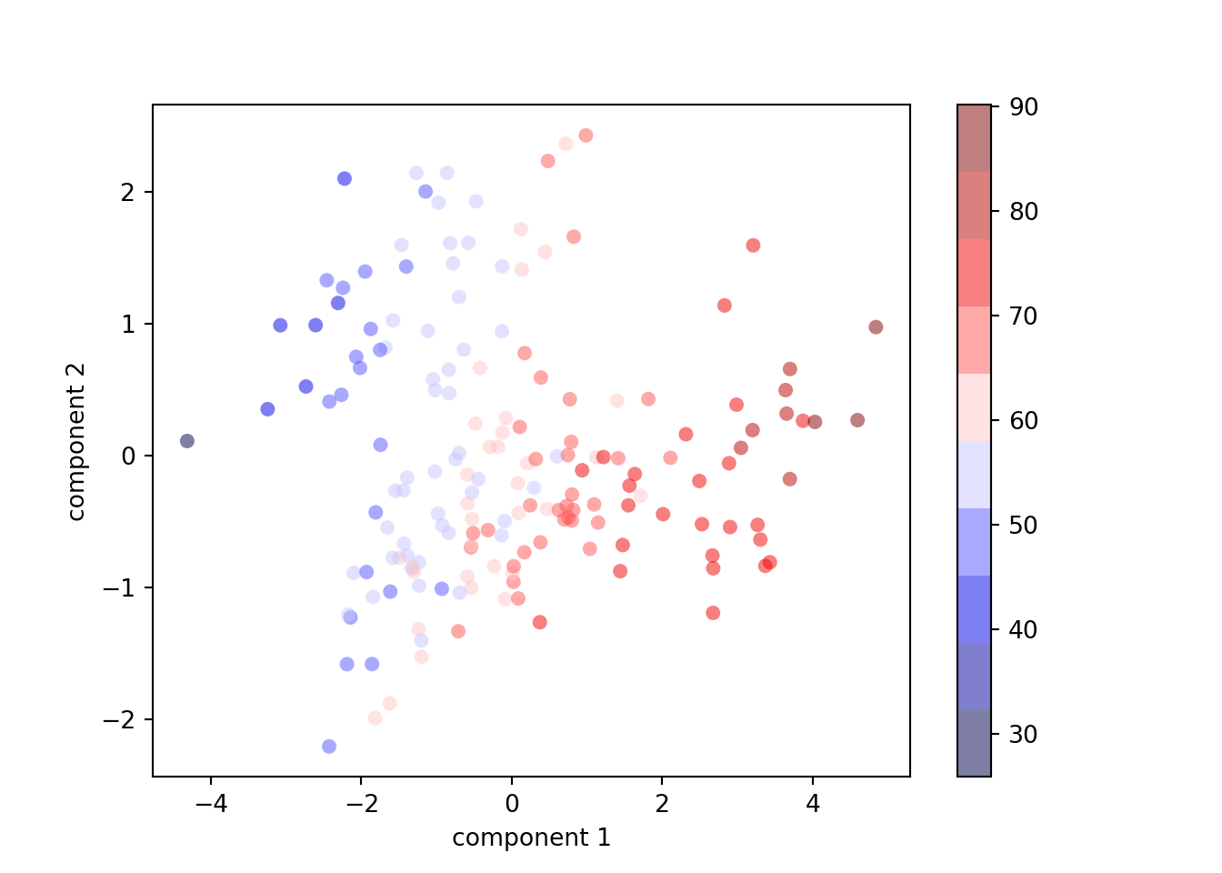
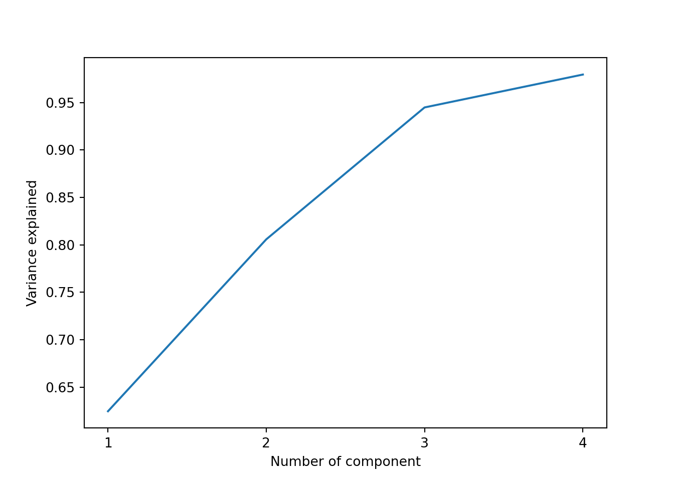
plt.plot(np.cumsum(pca.explained_variance_ratio_))
plt.xlabel("Number of component")
plt.ylabel("Variance explained")
plt.xticks(range(4), [1,2,3,4])
## ([<matplotlib.axis.XTick object at 0x000001907AA64410>, <matplotlib.axis.XTick object at 0x000001907AA66850>, <matplotlib.axis.XTick object at 0x000001907AA66FD0>, <matplotlib.axis.XTick object at 0x000001907AA67750>], [Text(0, 0, '1'), Text(1, 0, '2'), Text(2, 0, '3'), Text(3, 0, '4')])